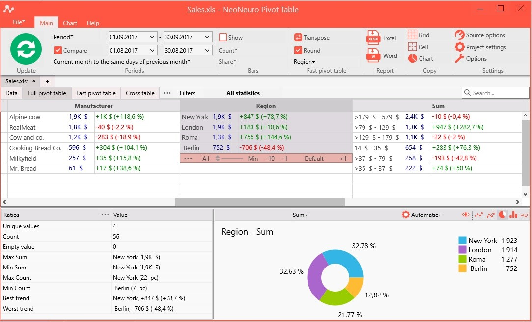
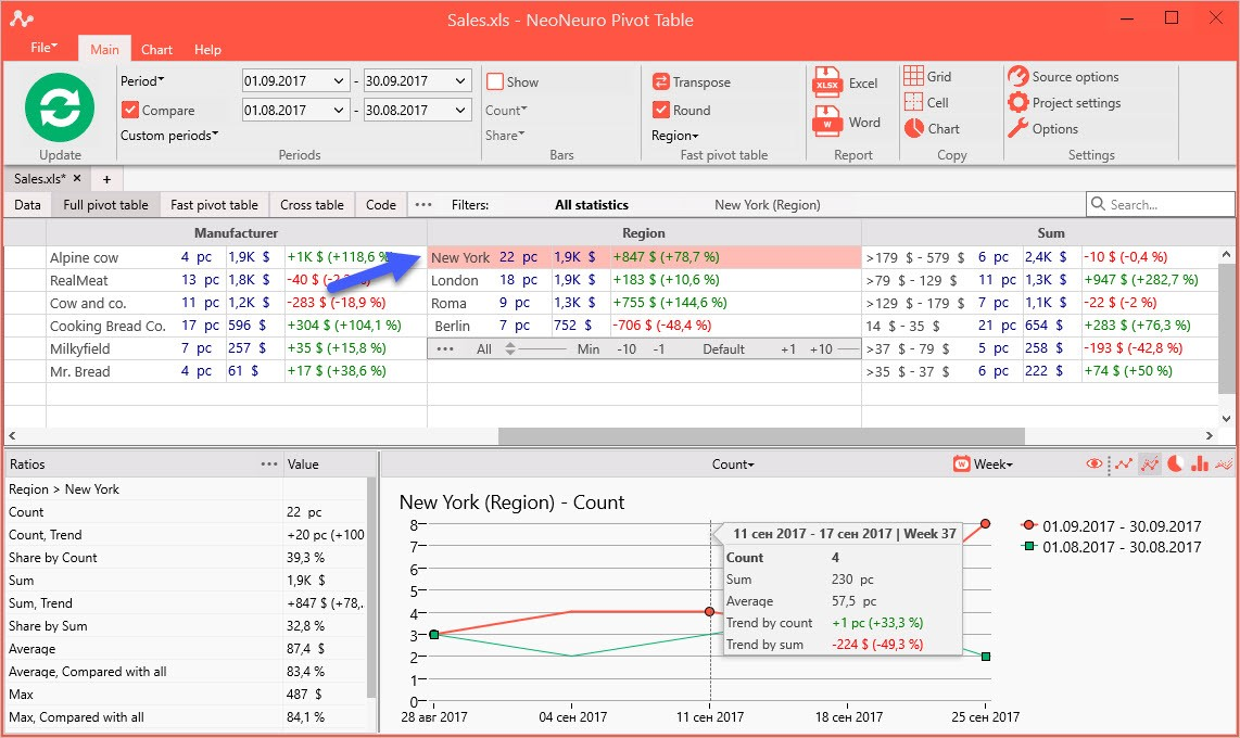
Get trends by selecting the type of chart and clicking on needed cells or parameters.
There are two types of chart for Cells:
· Line
· Compared to base periods
and two types of chart for Parameters:
· Pie
· Compared to base periods
Chart works with selected Ratio and can show sum, count, average value or shares.
Examples
1. Select “Region” parameter
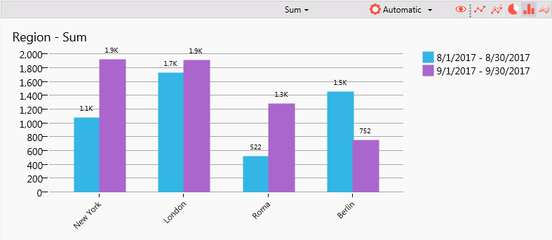
2. Select histogram icon to show compare periods histogram:
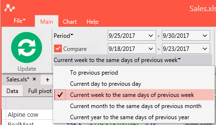
3. Select on the Main Tab: Compare periods -> Current week with the same days of previous week:
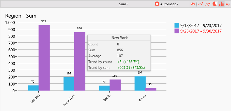
4. Chart will be shown like this:
This is a comparison chart for sales in two different months for each region.
We can view comparison as two lines for particular region, click on Region -> London and on icon with two lines: